10 Basic Website Optimization to Improve Organic Search Rankings

Optimize Your Website for SEO

Some of the quickest and easiest wins when it comes to SEO can be achieved just by taking a bit of time to optimize your website.

This doesn’t mean some sort of big overhaul, in fact, you’d be surprised to find out just how many businesses skip this step and then wonder why they are stuck at the bottom of page two of the search results. Don’t let this be you!

Even taking care of the simplest of things can give you a leg up.

Here’s where to get started:

  1. Create target keywords for each page of your website
  2. Have unique meta tags (i.e. titles and descriptions for each page)
  3. Make sure to include keywords in your URLs (especially for products or services)
  4. Include your target keywords in your headings on both pages and content
  5. Check to see you have included your target keyword 2-3 times on each page (but don’t go overboard)
  6. Link to posts and pages from within your site
  7. Optimize any images or videos that you have included
  8. Add outside links to your site like from social media profiles and directories
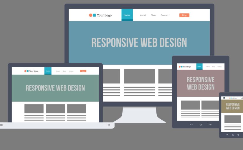
  9. Be sure your site is responsive (can easily be viewed on mobile devices)
  10. Be sure your site AMP (Accelerated Mobile Pages)

Those are the basics, and even just taking care of those will help improve your rankings over both the long term and the short term. Remember, any additional content you include on your site, be it a blog post or a new service, you want to be sure it is optimized.

Lastly, when it comes to optimization, don’t forget both speed and security. The majority of people who visit a site will leave if it doesn’t load quickly, and that’s for both desktop and mobile devices.

Run a speedtest to see how quickly your site loads, and if it feels like it’s lagging, consider upgrading to super-fast SSD hosting.

Hand in hand with speed comes security as well, especially if your customers can buy on your site, you want to be 100% sure it is secure, which is one way to really build more trust with your customers.

Consider upgrading your current site to HTTPS so that your entire site becomes completely secure. You’ll need an SSL Certificate for this. But don’t think this is just for eCommerce sites that accept payments. HTTPS is a stated Google ranking factor so it can give you can futureproof your website and get an advantage over the competition.

Need a professional help. You may visit our SEO Plans to find out some of our regular SEO packages along with their deliverables.

UPDATING YOUR WEBSITE FOR MOBILE DEVICES – INCREASE VISITORS & BUSINESS OPPORTUNITIES

Today, the majority of your target audience is most likely using a Tablet or Smart phone when online, and while browsing for products, manufacturers or business solution service providers.

If your site was developed years ago, it was coded to display on screens typically 15 inches and larger, and for standard browsers of the day like Internet Explorer. For end users trying to view on mobile devices may not be able to navigate the pages of your website or your site may not even render correctly, resulting in the loss of an opportunity.

Fortunately, there are several alternatives to refresh your current site with new design alternatives that are mobile device friendly and are typically economical to apply. For consideration are:

HTML5

Basically, HTML5 is a coding language that develops a website which is viewable across on web browsers and any devices, Windows, Apple, Smartphones and Tablets, regardless of the screen size, the site renders perfectly.

meeting_quest_html5

This means the end user will normally not need to scroll left and right or ‘pinch’ the page to see your content. Also, the code is much ‘cleaner’ than traditional HTML code, which means the site loads faster providing a more ‘user friendly’ experience.

Responsive Design

This coding approach goes a step further than HTML5 in that as the screen size reduces, the site ‘stacks’ on itself. Meaning the left column is on top, the middle moves underneath and finally the right column is listed below.

responsive-design

The top navigation icons group together and become a ‘dropdown’ nav and present all page content in a simple scroll down maintaining font sizes, image placement, etc. Another visitor friendly alternative.

Mobile App Development

In the event you have specific functionality on your site that may not function correctly when viewed through a mobile device, you may want to consider recreating the presentation with a mobile app and allow end users to download and view on the mobile devices, Tablets and Smartphones.

mobile-app-development

The NGR team is well versed in mobile app development, the code required for the Android and iOS operating systems, as well as installing the app on the Android Storefront and the Apple approval process.

We would sincerely appreciate the opportunity to discuss the alternatives in upgrading your website, the process and the budget considerations involved. If of interest, please contact me directly at (213) 457-3715 or email me at sales@ngrteam.com., you can request a proposal at Mobile Website Refresh and enter ‘mobile’ in the comments box.